Sunday, August 19, 2012
One of my major points is that propaganda heavily uses dichotomies and narratives. This picture shows both.
For most of the 20th centuries, many Americans looked at China with either condescension or contempt. It was a backwards land, and the idea of it even competing with America was ridiculous. Now, within the past ten years or so, we have the myth of China as technical super-marvel, with children who are uniformly brilliant, churning out technical marvels and high tech wizardry. Meanwhile, America is an underdeveloped country.
Like most narratives and dichotomies, it isn't true, the truth is somewhere inbetween. China was never as backwards as American arrogance had it, and it is not as space-age as our fears would have it. The pictures taken here are a good example: a very new looking Chinese train, coupled with an old looking American train.
I am not an expert on Chinese rail transport, but I did look it up on wikipedia and see that only 10% of China's rail network is suitable for high speed trains. When you compare the top 10 or 30% of China's accomplishments with the bottom 10 or 30% of America's accomplishments, we look pretty bad. Go and ride a passenger train in rural Hunan province, and we might start looking better.
Tuesday, July 31, 2012
Anti-Gun control seems to be a big well spring of bad sloganeering lately.
BTW, if anyone knows any bad Pro-Gun Control propaganda, I would be more than willing to critique it.
It is true that criminals don't obey gun laws. They are part of a subset of other laws that criminals don't obey, which is ALL OF THEM. That is kind of why they are criminals. So the easily facile response to this is "Criminals don't obey murder laws!"
Besides there is a difference. A gun is an instrumentality. It can be used for criminal purposes, or for non-criminal purposes. So in a society where guns are outlawed, criminals, who are willing to break the law, would have the ability to pursue further criminal ends, while law-abiding citizens wouldn't have the means to pursue self-defense.
Besides, of course, there is a thing about that "OBEY THE LAW" thing. Laws aren't always enforced because people choose to obey them. They are enforced because they have enforcement. In a society where guns were truly not available, criminals wouldn't have access to guns, no matter how much they clicked their heels together.
So one of the hidden premises in this phrase is that guns will always, be, de facto, available, and that their legal status will not stop criminals from accessing them.
Which is actually a pretty good argument. But that nuance is left out of the bumper sticker version because, well, honestly, [redacted].
BTW, if anyone knows any bad Pro-Gun Control propaganda, I would be more than willing to critique it.
It is true that criminals don't obey gun laws. They are part of a subset of other laws that criminals don't obey, which is ALL OF THEM. That is kind of why they are criminals. So the easily facile response to this is "Criminals don't obey murder laws!"
Besides there is a difference. A gun is an instrumentality. It can be used for criminal purposes, or for non-criminal purposes. So in a society where guns are outlawed, criminals, who are willing to break the law, would have the ability to pursue further criminal ends, while law-abiding citizens wouldn't have the means to pursue self-defense.
Besides, of course, there is a thing about that "OBEY THE LAW" thing. Laws aren't always enforced because people choose to obey them. They are enforced because they have enforcement. In a society where guns were truly not available, criminals wouldn't have access to guns, no matter how much they clicked their heels together.
So one of the hidden premises in this phrase is that guns will always, be, de facto, available, and that their legal status will not stop criminals from accessing them.
Which is actually a pretty good argument. But that nuance is left out of the bumper sticker version because, well, honestly, [redacted].
Monday, July 30, 2012
I haven't yet found a good metaphor for guns and their legality. Automobiles seem to be a favorite.
We could actually break this down into an equation:
Cars+Alcohol=Drunk Driving
Guns+Criminality=Gun Crimes
Which makes sense sense, although it fails on two major counts. One, alcohol is itself a product that is regulated, fairly heavily. "Criminality", or however else we want to measure what turns the controller of a gun into a criminal, is a more amorphous thing.
Secondly, while automobiles do have dangers, they also have a use that is different than the use of a gun. An automobile is used to get places. It can also kill people. A gun's primary use, however, is violence.
Thirdly...the words "sober people". Gun control would be more like making it harder for EVERYONE to own cars.
Again, I am not stupid enough to state an argument for gun control. All I am saying is that argument by metaphor and analogy is one of the weaker forms of argument.
Thursday, July 26, 2012
I am likely to believe in parts of this. Even without sources, it tells a story that I can believe.
However, there is a big question that I would ask, about whether things are quite as lopsided as this would indicate.
What are the sizes of the companies in these various countries? And do each of them have the same criteria for what makes a company? If Great Britain has laws that make it easier for smaller companies to incorporate, there could be dozens of small companies to every big one in the US, drawing the average down. I could question the data many other ways like this. So while this might be true, I don't know exactly how the data would be determined.
Wednesday, July 18, 2012
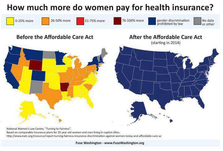
I don't know for sure, but having seen lots of maps like this, I have noticed that the choice of colors might be used to convey a message. Red colors seem to be used to convey policies or conditions that are irrational or undesirable, while blue is used to convey rational or desirable conditions.
Other than that (possibly paranoid) guess, this seems to be fairly straightforward and useful in its presentation.
Thursday, July 12, 2012
Here we have another example of two of the things propaganda does best: narrative and dichotomy. The narrative of "American Exceptionalism" is that the United States is a country with unique freedoms, history, and economic and cultural achievements. The counter-narrative is that Americans are big fat violent idiots.
Another problem is cardinal ratings. To use an example that isn't on here, the United States has the 35th highest life expectancy in the world. Which sounds pretty bad, but when put in terms of actual numbers, the US's raw number 77.71 years (77 years and 9 months) is not that far below the top nation (Japan, with 82.08 years (82 years and a month). On a bar graph, the distance between #5, Australia, 80 years, 7 months, #15 New Zealand 79 years, 7 months and #25 Great Britain (78 years, and 50 weeks) would look almost indistinguishable, especially compared to the dramatic differences in their cardinal rankings.
(http://www.nationmaster.com/graph/hea_lif_exp_at_bir_tot_yea-life-expectancy-birth-total-years), btw
But back to the stats they did mention: they chose 9. Which allows for the cherry picking of data. Also, some of the things they collected seemed rather...dissimilar. I don't think teen pregnancy is the same as rape.
But much more simpler, lets look at some of those stats. Actually, lets just look at one of them because life is short. I actually couldn't find data for "heart attacks", but I did find data for "heart disease deaths" in 26 developed country, again on the very useful nationmaster.com. On this graph, the US is at #13. In terms of numbers, the US has 106.5 heart disease deaths per 100,000 people, significantly less than Slovakia at 216 per, significantly more than Japan at 30 per, and almost the same as Germany at 106.1 per.
If you actually look through statistics, there is not a lot of support for theories of American exceptionalism either for the bad or for the good. The US statistically usually rates about the same as other developed countries, sometimes a bit better, sometimes a bit worse. Usually spinning the numbers into a narrative requires a) cherry picking data and/or b) using cardinal rankings to turn what might be a small discrepancy into a horse race.
Another problem is cardinal ratings. To use an example that isn't on here, the United States has the 35th highest life expectancy in the world. Which sounds pretty bad, but when put in terms of actual numbers, the US's raw number 77.71 years (77 years and 9 months) is not that far below the top nation (Japan, with 82.08 years (82 years and a month). On a bar graph, the distance between #5, Australia, 80 years, 7 months, #15 New Zealand 79 years, 7 months and #25 Great Britain (78 years, and 50 weeks) would look almost indistinguishable, especially compared to the dramatic differences in their cardinal rankings.
(http://www.nationmaster.com/graph/hea_lif_exp_at_bir_tot_yea-life-expectancy-birth-total-years), btw
But back to the stats they did mention: they chose 9. Which allows for the cherry picking of data. Also, some of the things they collected seemed rather...dissimilar. I don't think teen pregnancy is the same as rape.
But much more simpler, lets look at some of those stats. Actually, lets just look at one of them because life is short. I actually couldn't find data for "heart attacks", but I did find data for "heart disease deaths" in 26 developed country, again on the very useful nationmaster.com. On this graph, the US is at #13. In terms of numbers, the US has 106.5 heart disease deaths per 100,000 people, significantly less than Slovakia at 216 per, significantly more than Japan at 30 per, and almost the same as Germany at 106.1 per.
If you actually look through statistics, there is not a lot of support for theories of American exceptionalism either for the bad or for the good. The US statistically usually rates about the same as other developed countries, sometimes a bit better, sometimes a bit worse. Usually spinning the numbers into a narrative requires a) cherry picking data and/or b) using cardinal rankings to turn what might be a small discrepancy into a horse race.
Sunday, July 8, 2012
One of the basic truths of a democracy is that we aren't all like each other. If we were, then we could just choose someone at random, and make them dictator, and it wouldn't matter because we all believed the same.
As mentioned previously, one of the basic techniques of propaganda is to create dichotomies. And this picture is a great example of that. Some of the distinctions drawn are somewhat exaggerated. "We struggle to survive. Romney flaunts his wealth." There are a lot of people struggling, but that "we" are struggling is creating a dichotomy: many people are, if not doing peachy keen, still not "struggling". And as for Romney flaunting his wealth, Romney isn't exactly the "flaunting" type. It might actually be better for him if he was. The last item is an especially strong blanket statement. "We've lost the American Dream. Romney killed the American Dream". While the morality of the type of corporate financing that Romney did is a very open question, both the fact that the "American Dream" has been lost, and that Romney (personally? all by himself?) killed it is a very overarching dichotomy.
Also, what is he doing on his fingers? Really counting his mansions?
But, to go back to my first point. In a Democracy, we have a variety of people with different backgrounds and beliefs, and sometimes we will support someone politically who doesn't have the same background as us. But it is also reasonable that we expect those people to have some type of understanding of us. So while the image uses some pretty base dichotomizing to paint Romney as different, it is also fair to ask whether he has the background to understand what we are going through.
Wednesday, July 4, 2012
Hopefully this blog won't turn into one of those things where I have a good idea and then forget about it. Or even a mediocre idea and forget about it.
There is a lot of dumb stuff on the internet still, but sometimes I don't make it a priority to point it out.
But I am back for a special Fourth of July edition!
So here we have some narrative: an important science story overlooked by a public who would rather read about Justin Bieber.
My own exception to this is that on July 4th, we shouldn't be reading about Canadians.
Anyway:
I couldn't find any mention of Just Bieber's temper tantrum on my yahoo news feed. There is mention of the Higgs Boson, although they "humanize" it up by talking about how Dr. Hawking is losing a bet. And the picture news is about BBQ sauce, which is fitting for the holiday.
Furthermore, while it is true that Yahoo's front page news tends to be slanted towards human interest stories, its also true that Yahoo's front page news is not indicative of the world or country as a whole. How would Captain Picard feel if we judged his entire life by the times he became a spokesman for the Borg?
Game, set, match.
There is a lot of dumb stuff on the internet still, but sometimes I don't make it a priority to point it out.
But I am back for a special Fourth of July edition!
So here we have some narrative: an important science story overlooked by a public who would rather read about Justin Bieber.
My own exception to this is that on July 4th, we shouldn't be reading about Canadians.
Anyway:
I couldn't find any mention of Just Bieber's temper tantrum on my yahoo news feed. There is mention of the Higgs Boson, although they "humanize" it up by talking about how Dr. Hawking is losing a bet. And the picture news is about BBQ sauce, which is fitting for the holiday.
Furthermore, while it is true that Yahoo's front page news tends to be slanted towards human interest stories, its also true that Yahoo's front page news is not indicative of the world or country as a whole. How would Captain Picard feel if we judged his entire life by the times he became a spokesman for the Borg?
Game, set, match.
Wednesday, June 27, 2012
An important part of propaganda is symmetry.
And an important part of symmetry is that it usually doesn't exist quite so much in the real world.
This is a clever use of symmetry, although it is somewhat forced.
The most salient point is that Julian Assange's villainy, at least what he has gotten in the most trouble for, is not for wikileaks, but for alleged sexual assaults. And there is a chance that these charges were trumped up, but the image isn't really about this.
In addition, Time Magazine's "Man of the Year" award isn't always a good thing (although in recent years, it has been). It just means that someone has made the most difference in the past year, whether for good or for bad.
So when you look at the facts, the neat symmetry of the image doesn't really have the content that it is supposed to.
Monday, June 25, 2012
I am a vegetarian, and even if I weren't, I probably wouldn't eat at either of these restaurants.
I don't know how accurate this is. I don't know if the people who shot this really did "rotate to most attractive angle". They might have done some 'shopping of their own.
But, I would suspect not, because I wouldn't doubt that the differences between advertisements and products is just as big as shown here.
I don't know how accurate this is. I don't know if the people who shot this really did "rotate to most attractive angle". They might have done some 'shopping of their own.
But, I would suspect not, because I wouldn't doubt that the differences between advertisements and products is just as big as shown here.
Sunday, June 24, 2012
I think this is why they say "Trigger Warning", only in this case, not:
I have seen some pictures on Facebook that show pictures of starving, emaciated people.
For example, on gay marriage, one would have a picture of a gay couple and a starving child, and say "if this [the gay couple] offends you more than this [starving child], you need to check your values".
I find pictures of people suffering to be unsettling, and starvation/emaciation especially so.
But apart from my squeamishness, I think it is ethically wrong and exploitative to use pictures of people suffering to make a point. It is also borderline racist, in that it depicts a stereotypical starving African. Africa has aspects of its culture and history other than suffering so we can make rhetorical points.
There might be people who have differences with me on this matter, but I think of these types of image as particularly tasteless propaganda.
I have seen some pictures on Facebook that show pictures of starving, emaciated people.
For example, on gay marriage, one would have a picture of a gay couple and a starving child, and say "if this [the gay couple] offends you more than this [starving child], you need to check your values".
I find pictures of people suffering to be unsettling, and starvation/emaciation especially so.
But apart from my squeamishness, I think it is ethically wrong and exploitative to use pictures of people suffering to make a point. It is also borderline racist, in that it depicts a stereotypical starving African. Africa has aspects of its culture and history other than suffering so we can make rhetorical points.
There might be people who have differences with me on this matter, but I think of these types of image as particularly tasteless propaganda.
Tuesday, June 19, 2012
So one of my jobs here is to be the guardian of critical thinking. Two posts ago, I have a pass to the above image, saying that it got me thinking, and I found its "argument" to be fairly sound.
Someone on the internet was less swayed, and released this picture as a counter-punch.
And to quote Amy Pond (and dang, Amy Pond herself is an endless argument waiting to happen about women in geek culture, because she is assertive, has sexy legs, kills people, is kidnapped, and lets a strange man into her house as a 9 year old, but isn't scared of him...where do we even start! Anyway, moving on...) "Okay kids, this is where it gets complicated".
Even though the people picked in the above picture are cherry picked...so are the people in the below picture. I am actually not up on things, so I can't identify them, but... Lady Gaga? Wouldn't Madonna be more representative? But Madonna would certainly not be a point against pop culture female sexuality.
And I actually can't really even identify the women from "Geek culture" below...I don't know if they are representative. Although the entire "chainmail bikini in freezing snow" thing certainly is a well known trope. But...
Well, this is where it is complicated. The culture around is full of messages, some of them overt, some of them covert. And they all say different things, and it is hard to decide what is the real message. So...um, well, its an interesting debate, isn't it?
Also: all data is cherry picked.
Monday, June 18, 2012
Sunday, June 17, 2012
This one got passed around a lot and quickly, and it deserves mention.
For one thing, I am glad we still remember Babylon 5.
As I have mentioned before, it is easy to make an image that misleads my taking two images that aren't representative, and holding them next to each other.
But after I saw this one, I started thinking: in popular culture, are there any women who don't fit the stereotypes of weak sexualized females?
I guess you have a few actresses that are mature enough to get attention for good roles that aren't based purely on sex. But every time that Meryl Streep gets attention for doing her job well, there are about 20 articles because Lindsay Lohan flashed her underwear.
So, yeah, this got me thinking, and the more I thought about it, the more I realized it was true.
Of course, there are things that are 'problematic' about the portrayal of the above women, but...well, that again is another issue entirely.
Friday, June 15, 2012
Is this an image? Its a picture of words.
Pictures of words always mean more than just plain simple words.
So, lets look at a scenario.
You are a 13 year old boy with poor impulse control and poor social skills, which comes across as teasing and slurs. You don't know or don't understand how much this offends people. Then, one day, a full grown man grabs you and assaults you.
Who is the bully in this situation?
The story presented here doesn't have any context. The boy doing the bullying could be a hardened deliberate sadist, or he could just be a boy who is unaware of what he is doing. In either case, is violence the answer?
One of the things that propaganda does is make people "acceptable targets". Homophobia and bullying are not popular things, and by presenting someone as a homophobic bully, you make them a target for...more bullying.
Wednesday, June 13, 2012
This is a great example of imagery and propaganda.
Which is not to say that the entire morality and utility of the Iraq War isn't up for debate, but this is probably not the way to do it.
The most striking thing about the bottom picture is: there is a sandstorm. Or pollution. Or both. I am not the biggest expert on the meteorology of Iraq, but I think that sandstorms there are a fairly common experience. I don't know if the form of government changes that. So throwing in the entire sandstorm thing is a bit dishonest, since it isn't relevant.
As for the fact that Iraq was otherwise made more haggard by the US invasion...well, that gets into the entire history of Iraq. In the 1970s, Iraq was rapidly developing, something that reversed course during the war with Iran, the first Gulf War, the period of sanctions, the second war, the civil war...
But the fact that there were neighborhoods that looked passably spiffy under Saddam Hussein is not really indicative of what life in Iraq was like overall.
Monday, June 11, 2012
Sunday, June 10, 2012
The point of this blog is mostly to look at stuff I see posted around the internet, because the internet is the world's greatest source of mis-information. But the world being what it is, I also feel like I should branch out and address all the many other sources of misinformation and propaganda out there.
I actually only skimmed through the article in question, and the cover might misrepresent it. Not by much, but at least a little.
Do you know what the issue is here? There are several issues. One is the crippling lack of irony. The National Review is a right wing magazine, so the article is about how liberals tend to speak in, and believe in, clichés. Which is certainly true at times, but the cover seems to address the issue of clichés with...more clichés. I am sure there is some young radical with an ipod and a Che Gueverra t-shirt, but I haven't actually seen one. Actually, I haven't seen any Che Gueverra t-shirts for a while.
But there is a bigger issue than just a lack of irony or self-examination.
The real issue is propaganda, and how image and language intersect.
If we look at this image, we see a few things: the man is yelling, he is a consumer, he is trendy, he is holding a sign with an empty meaning, and he is manipulated by those above him. And this might be an obvious conclusion, but the image works by putting the ideas in the viewer's mind, without actually asserting them. When a statement is made in language, the reader has a chance to refute it or accept it. "Most liberal protesters are loud and vacuous, and manipulated by those above them." You can believe it, not believe it, or leave it undecided, but language kind of by definition involves conditional statements. Imagery, on the other hand, deals with universals, with universals here being another term for "clichés". The image is meant to be insinuated into the viewer's mind. And, in a world where we don't always have time to think about what we see, it often succeeds.
Saturday, June 9, 2012
I believe this graph comes from somewhere official in the Obama campaign.
I didn't notice it when I first looked at it, but there is one important piece of information that is missing. Who is going to spot it first?
One of the problems with graphs is that there is always alternative ways to look at information. For example, I am assuming that this graph doesn't take into account the rate of inflation, which is probably why Carter sticks out like a sore thumb. Obama has had many economic problems, but inflation isn't one of them. So there are different ways that this data could be presented, and they might not always look like this.
But: overall, this is good. It presents the information clearly and succinctly. Although the case for Obama's restraint at spending might not be as clear as this graph says, it is good for one thing: dislodging a narrative.
It puts the burden of proof on the entire "Obama is a socialist" narrative back on the people who support it. Like most narratives, that one is more about identity politics than actual policy politics, but that is another discussion entirely.
Subscribe to:
Posts (Atom)